The Psychology Behind Effective Web Design
Colors, Layouts and More
You know that saying, “Rome wasn’t built in a day”? Well, the same is true for a successful website. It takes careful planning and a deep understanding of your target audience and their behaviors to build a successful site. From the colors you choose to the number of navigation buttons available and the organization of your content, every decision, whether you’re aware of it or not, will subtly (or not so subtly) impact how your end users make decisions.
It takes some work, but finding that sweet spot that balances your business needs with your end users’ interests will lead to positive returns down the line. Users make decisions for various reasons, from their emotional state to the effort required to find information. The most successful sites consider all these factors during development and continuously test and review performance.
There’s no one way users make decisions. Everything from the color and shape of your logo to the media you choose will influence the end user toward or against an action. We’ll go over several factors, but let’s start with intuitive design.
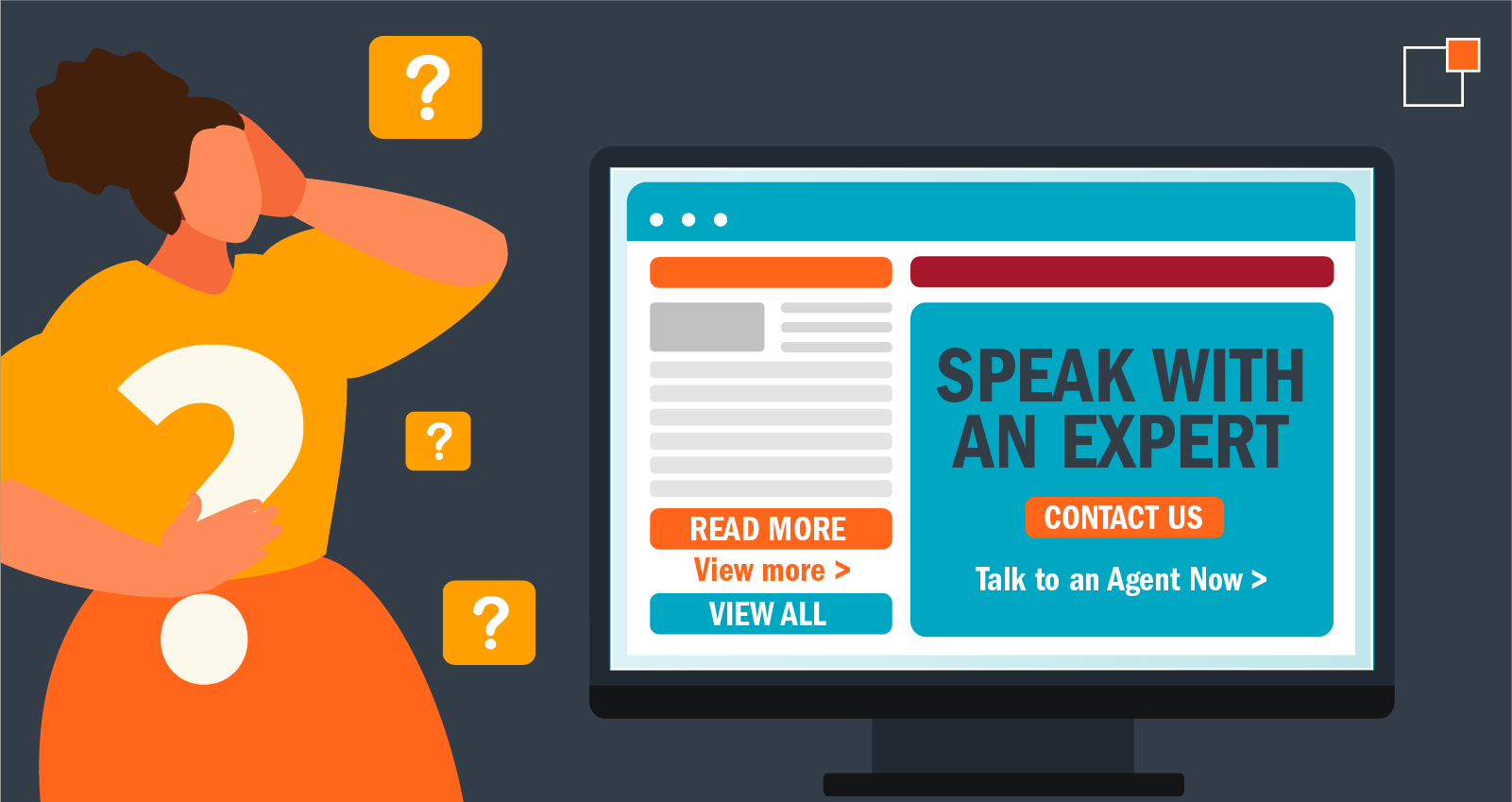
Intuitive navigation is essential for a positive user experience, as it ensures users can easily find the information they need without confusion or frustration. The psychology behind intuitive design involves creating a logical structure that aligns with users' expectations and mental models. This includes using clear labels, logical groupings and familiar symbols and icons. For instance, placing the main menu at the top of the page or on the left side aligns with common user expectations, making it easier for them to explore the site.

Decision fatigue is a real thing. All day long, people have to make hundreds of choices, from personal to professional, and it gets to be exhausting. The last thing you want is to discourage a user from engaging with your site by offering too many options or clustered navigation. Intuitive navigation reduces the cognitive load on users, allowing them to focus on the content rather than figuring out how to navigate the site. By prioritizing intuitive design, you create seamless and enjoyable user experiences that funnel your target audience toward your desired outcome.
Beyond easy navigation, there are a few other factors to consider:
Again, you don’t want to make your users think too hard in order to find the information they’re looking for – your website isn’t a test, after all! Users typically scan web pages in an F-shaped or Z-shaped pattern, meaning the placement of key elements should cater to these reading patterns.
Visual hierarchy is a fundamental principle in web design that guides users' attention to the most critical elements first. You can do this by using size, color, contrast and placement. For instance, larger, bolder headlines naturally draw the eye first, followed by smaller subheadings and body text. Effective use of whitespace also plays a crucial role, allowing the most important elements to stand out and preventing the page from feeling cluttered.
Prioritizing and structuring content hierarchically not only improves user satisfaction but also increases the likelihood of achieving desired actions, such as making a purchase or filling out a form.
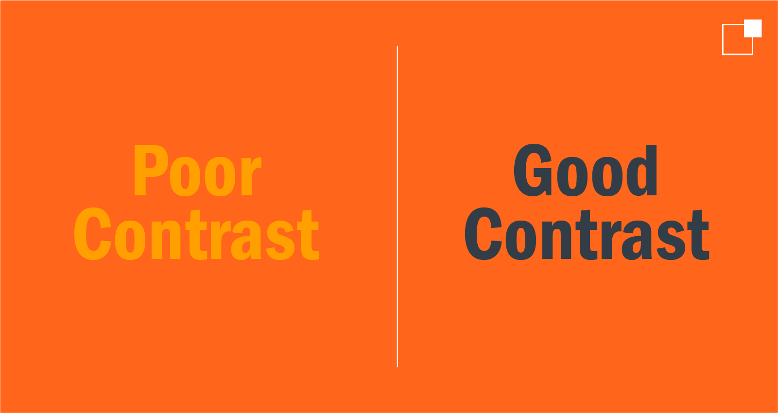
Colors affect readability and usability. Without proper contrast between background and text, users will have to work extra hard to find the information they’re looking for, especially users with visual impairments. Remember, the goal is to create a stress-free, easy-to-navigate site, and a well-thought-out color palette is one way to help make that happen. You can guide users' actions and highlight essential elements by using contrasting colors for elements like call-to-action buttons to make them stand out.

Colors can also evoke different emotional responses. In Western cultures, blue is often associated with trust and calmness, while red can evoke excitement and urgency. So, choosing colors that align with the emotional state you want your users to be in is essential. It’s also important to note that perceptions of colors vary widely across different cultures, so you’ll need to make sure your color scheme resonates with the target audience.
No one wants to feel manipulated, so the trick with persuasive design is its ability to tap into users' subconscious minds. By leveraging cognitive biases and emotional triggers, you can craft natural and compelling experiences without acting like a puppet master. Using these techniques ethically and transparently is important so users feel empowered rather than manipulated. A well-executed persuasive design can create a win-win situation where users find value in their interactions and businesses achieve their goals.
Potential adopters visiting the website are likely filled with excitement and positive anticipation as they search for their future furry friend. The website design should evoke and enhance these positive emotions to harness this positive energy. Imagine landing on a homepage filled with vibrant images of happy families with their pets, dogs playing joyfully in parks and heartwarming pictures of the adorable animals available for adoption. Now imagine the same site, only it’s primarily text-based with limited or dreary images of the animals. One of these sites is using psychology to its favor - and it's not the one with sad puppies.
Visuals can create an immediate emotional connection and make visitors feel even more enthusiastic or totally disengaged. People are naturally drawn to visual content that reflects their emotions and aspirations, so using imagery that aligns with the end goal you want your users to take is crucial.
Using human psychology to your favor may seem like trickery, but chances are your target audience is looking for your product or service. While you should use these tools responsibly, giving your users the best experience possible can empower them to easily make decisions. Utilizing these principles helps create and enhance the user experience, which will help promote more positive feelings toward your business and hopefully lead to a loyal customer.
Ready to build the site you’ve always wanted? If you’re starting from scratch or just need a second set of eyes to review your current website, our Web Developers are here to help. Let’s chat!
It takes some work, but finding that sweet spot that balances your business needs with your end users’ interests will lead to positive returns down the line. Users make decisions for various reasons, from their emotional state to the effort required to find information. The most successful sites consider all these factors during development and continuously test and review performance.
The psychology of decision making
There’s no one way users make decisions. Everything from the color and shape of your logo to the media you choose will influence the end user toward or against an action. We’ll go over several factors, but let’s start with intuitive design.
What is intuitive design?
Intuitive navigation is essential for a positive user experience, as it ensures users can easily find the information they need without confusion or frustration. The psychology behind intuitive design involves creating a logical structure that aligns with users' expectations and mental models. This includes using clear labels, logical groupings and familiar symbols and icons. For instance, placing the main menu at the top of the page or on the left side aligns with common user expectations, making it easier for them to explore the site. 
Decision fatigue is a real thing. All day long, people have to make hundreds of choices, from personal to professional, and it gets to be exhausting. The last thing you want is to discourage a user from engaging with your site by offering too many options or clustered navigation. Intuitive navigation reduces the cognitive load on users, allowing them to focus on the content rather than figuring out how to navigate the site. By prioritizing intuitive design, you create seamless and enjoyable user experiences that funnel your target audience toward your desired outcome.
Beyond easy navigation, there are a few other factors to consider:
Visual hierarchy
Again, you don’t want to make your users think too hard in order to find the information they’re looking for – your website isn’t a test, after all! Users typically scan web pages in an F-shaped or Z-shaped pattern, meaning the placement of key elements should cater to these reading patterns. Visual hierarchy is a fundamental principle in web design that guides users' attention to the most critical elements first. You can do this by using size, color, contrast and placement. For instance, larger, bolder headlines naturally draw the eye first, followed by smaller subheadings and body text. Effective use of whitespace also plays a crucial role, allowing the most important elements to stand out and preventing the page from feeling cluttered.
Prioritizing and structuring content hierarchically not only improves user satisfaction but also increases the likelihood of achieving desired actions, such as making a purchase or filling out a form.
The psychology of colors
Colors affect readability and usability. Without proper contrast between background and text, users will have to work extra hard to find the information they’re looking for, especially users with visual impairments. Remember, the goal is to create a stress-free, easy-to-navigate site, and a well-thought-out color palette is one way to help make that happen. You can guide users' actions and highlight essential elements by using contrasting colors for elements like call-to-action buttons to make them stand out. 
Colors can also evoke different emotional responses. In Western cultures, blue is often associated with trust and calmness, while red can evoke excitement and urgency. So, choosing colors that align with the emotional state you want your users to be in is essential. It’s also important to note that perceptions of colors vary widely across different cultures, so you’ll need to make sure your color scheme resonates with the target audience.
Persuasive design
Persuasive design incorporates psychological principles to influence user behavior and decisions on a website. This requires a deep understanding of how users think and what motivates them toward an action. It’s a subtle way to guide users using techniques such as social proof and scarcity. For example, showcasing testimonials and reviews can build trust and encourage users to make a purchase, while limited-time offers can create a sense of urgency, prompting immediate action.No one wants to feel manipulated, so the trick with persuasive design is its ability to tap into users' subconscious minds. By leveraging cognitive biases and emotional triggers, you can craft natural and compelling experiences without acting like a puppet master. Using these techniques ethically and transparently is important so users feel empowered rather than manipulated. A well-executed persuasive design can create a win-win situation where users find value in their interactions and businesses achieve their goals.
Emotion-driven decisions
We’re all prone to making decisions based on emotions; it's part of being human. When we feel excited about a potential opportunity, product or experience, our actions and choices often reflect that positive energy. On the other hand, when we feel neutral or negative, our behaviors tend to be more cautious or indifferent. In addition to more technical aspects, such as loading speeds and intuitive navigation, you also need to consider elements that can subtly put or keep your audience in a positive and excited state of mind. Let’s look at a pet adoption agency as an example.Potential adopters visiting the website are likely filled with excitement and positive anticipation as they search for their future furry friend. The website design should evoke and enhance these positive emotions to harness this positive energy. Imagine landing on a homepage filled with vibrant images of happy families with their pets, dogs playing joyfully in parks and heartwarming pictures of the adorable animals available for adoption. Now imagine the same site, only it’s primarily text-based with limited or dreary images of the animals. One of these sites is using psychology to its favor - and it's not the one with sad puppies.
Visuals can create an immediate emotional connection and make visitors feel even more enthusiastic or totally disengaged. People are naturally drawn to visual content that reflects their emotions and aspirations, so using imagery that aligns with the end goal you want your users to take is crucial.
Design matters
Using human psychology to your favor may seem like trickery, but chances are your target audience is looking for your product or service. While you should use these tools responsibly, giving your users the best experience possible can empower them to easily make decisions. Utilizing these principles helps create and enhance the user experience, which will help promote more positive feelings toward your business and hopefully lead to a loyal customer.
Ready to build the site you’ve always wanted? If you’re starting from scratch or just need a second set of eyes to review your current website, our Web Developers are here to help. Let’s chat!
About the Author
Gabriella Caldwell is a Digital Marketing Strategist at thunder::tech. Outside of the office she can be found in a ceramics studio sculpting away, or visiting local art galleries.
