How to Create Impactful Visual Content
Improve brand engagement with visual content
When carefully crafting your brand’s image through social media channels, the most impactful tool you can leverage is strategic, high-quality visual content. Infographics, videos, charts, animations and illustrations play a significant role in driving engagement towards your brand. Visual content is 40 times more likely to be shared across social channels than any other type, highlighting how effective it is in reaching your audience. By crafting captivating visual content that informs, entertains and inspires, you can make a lasting impression and boost brand loyalty!
Follow these best practices to create impactful visual content for your brand:
Establish a visual style
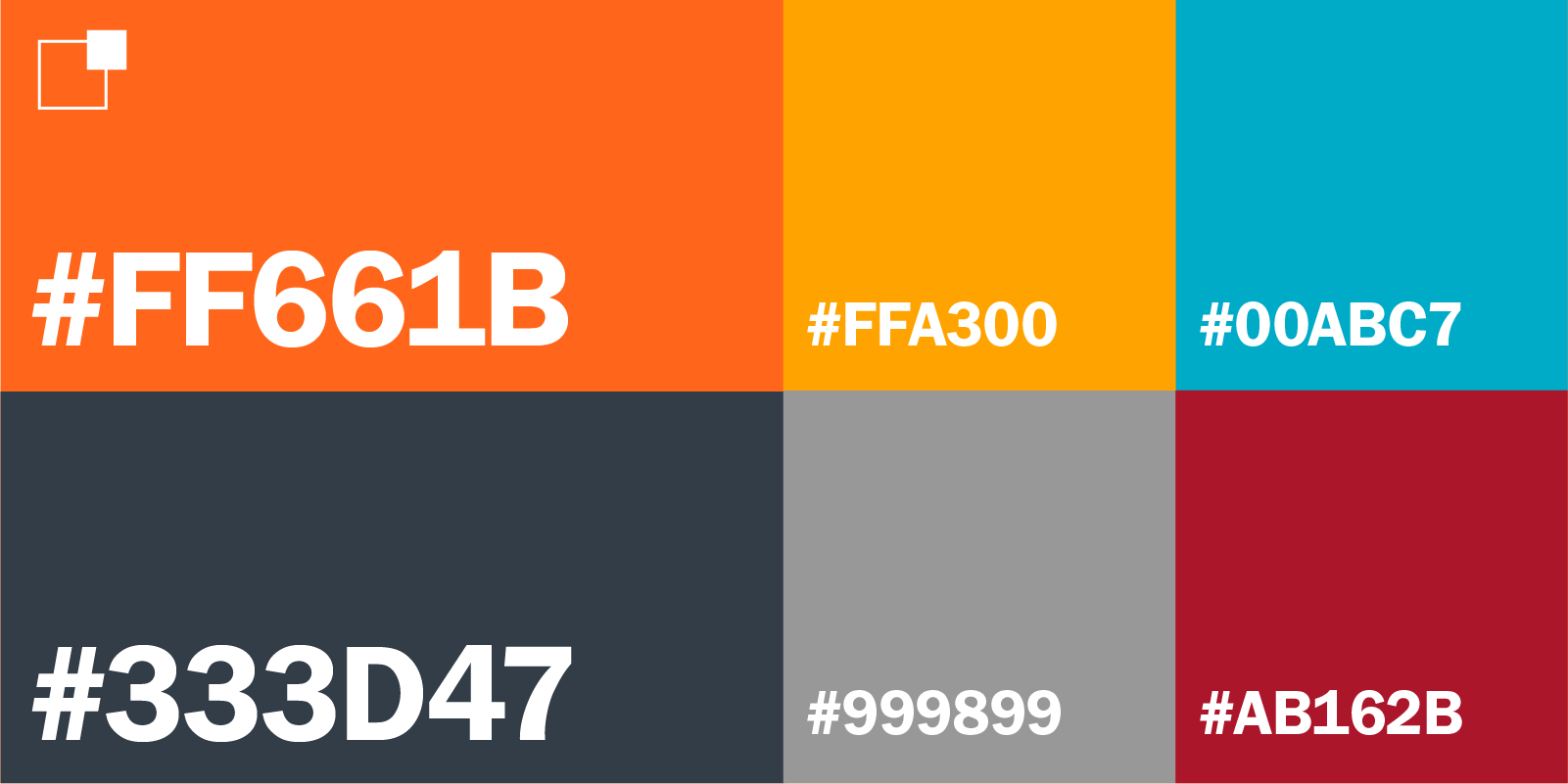
Your visual style sets you apart from other brands, making you instantly recognizable on crowded social media platforms. Think of your brand colors, logos and images as the bread and butter of your visual content, authentically representing your brand’s image. Maintaining consistency across your visuals with your unique color palette ensures your audience correctly identifies your brand, building trust and familiarity.
To help keep your visual style nice and organized, use a content hub to store branded assets and templates in one place. This content hub can house all the elements that define your brand’s visual identity – color palettes, templates, logos, images and videos. Storing these materials in a centralized location keeps everything secure and easy to access!

Use high-quality building blocks
This may seem like a no-brainer but utilizing your resources to capture and create high-quality visual content is a must! Low quality, blurry photographs aren’t very likely to draw in a crowd in this digital age, where access to high-quality cameras (yes, even phone cameras) and editing is available now more than ever.
But, if you don’t have a high-quality camera or phone, we’re not going to leave you high and dry. Resources like Pixabay and Unsplash offer free, high-resolution stock photos with commercial licenses.
Incorporate text (in moderation)
We advise using text, when appropriate, to highlight the topic you’re speaking on. When utilizing text on your brand’s visual content, elevate this by selecting a readable font (consistent with your visual style) and overlaying it on a strong image that doesn’t affect its legibility. Incorporating a title that aligns with your topic into your visual content is a great way to engage your audience and provide context. For example, try posting the title of your next blog on the image you use to advertise it.
Switch things up
Consider how your posts will appear and fit in with the rest of your feed. We’ve all encountered an aesthetically pleasing Instagram profile with a perfect balance of visuals and engaging content. Tap into that strategy and think about what makes it so cohesive. The best way to declutter your feed and create a unified look is by alternating between a mix of visuals with photos, text, graphics, art and videos. This mix also includes the order in which you post. For example, if your brand posts a visual with text on it, aim for something lighter in the next post with no text, such as a photo or non-text graphic.
Leave your signature
Include your logo on the content you want your audience to share, especially on infographics. Leaving your own signature mark on your visual content credits your brand for the work displayed and helps your audience identify the content with your brand. Exercise caution with this approach to avoid making your content overwhelmingly branded. Also, be mindful of your logo colors potentially clashing with the rest of your content; in these cases, opt for a greyscale version of your logo.
Understand representation
Crafting visual content that resonates starts with understanding your audience. To connect with your audience and build brand loyalty, confirm that the images and videos you select accurately reflect the demographics and diversity of your user base. Failing to do so can result in content that misses the mark with your brand’s desired audience, leading to a loss of engagement. If you are unsure about your visual content representation, consult a Diversity, Equity and Inclusion (DEI) coordinator for advice before posting to prevent any complications.

Optimize for each platform
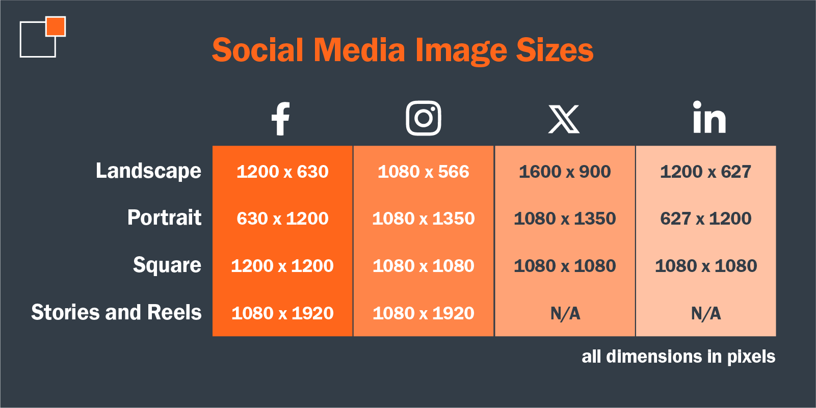
Preparing visual content for each social media platform can be challenging. You may have a piece of content that fits your LinkedIn feed perfectly, but if you plan on posting it on multiple platforms, remember — that does not fit all! Here is our guide on post sizes to help simplify resizing for various social media platforms:

Consider your profile as a whole
Look at your social media profile through the lens of your audience. Is the content captivating? Is there a balanced mix of visuals and text? Do your posts flow together or do any stick out like sore thumb? If you were to be a first-time viewer of your profile, would you follow or would you scroll past?
If your social media presence isn’t up to par, we can offer you a few tips! Start by looking at your profile picture, and cover photo if using X or Facebook. Select a visually appealing profile picture that represents your brand. Next, (if applicable) choose an on-brand cover photo that complements your profile picture. Your profile picture and cover photo are one of the first things viewers see when they visit your profile, so you want to make a good first impression!
Our next piece of advice is to scroll through your feed and gauge whether your posts are consistent and how certain posts look next to others. Some posts may be word- or graphic-heavy, while others may be photos of events, products, or behind-the-scenes moments. Where you place each post on your feed determines how organized and visually appealing a profile appears to the public eye. Keep this in mind when creating and scheduling future posts for your brand!

Don’t forget thumbnails
Big “thumbs” up for those who have already caught on to this! Did you know that when you post videos you can choose the photo or frame that gets chosen to be displayed on your feed? This photo or frame chosen from your video is called a thumbnail. Thumbnails are important for your visual content because they give your audience a preview of your video or reel, which, when done right, can make your post a lot more tempting to click on!
Harness the power of visuals
Since the majority of your audience is on social media, mastering visual content creation can help you grab their attention and spark conversations. It's another powerful tool in your marketing toolbox, allowing you to directly connect with your audience and leave a lasting impression. By leveraging these nine best practices, you can create impactful visuals that attract, engage and ultimately convert your social media audience. After all, a picture (and in this case: graphics, videos, etc.) is worth a thousand words, so don’t just settle for anything. Create a visual that tells the right story about your brand and connects with your users.
Are you curious about how you can craft and establish your brand’s image effectively? Get in touch with our team today to see how we can transform your brand’s organic social media. Contact us, and let’s elevate your brand’s potential together!
About the Author
Elise Kleinoeder is a Communications Intern at thunder::tech. Outside of work you can find her relaxing near the lake.
