The Essentials of an Effective PDP
Mastering the digital aisle
When you stroll through a store, a perfectly curated display or creative label might draw you in, sparking curiosity about a product you weren’t even looking for. Maybe it’s the weight of the package in your hands, the texture of the material or the way it’s presented on the shelf that convinces you it’s worth considering. That tactile connection helps you decide whether the product belongs in your cart.
Shopping online isn’t all that different, but in this digital space, product description pages (PDPs) replace those labels, displays and hands-on encounters. Without the chance to physically interact with the product, customers rely on the words, images and the design of a PDP to guide their decision. A well-crafted product page can recreate that in-store moment by giving customers the right mix of information and inspiration to confidently hit "Add to Cart."

Know your audience and their pain points
To write effective product description pages (PDPs), you have to know your audience and what they care about. Just like building a user-friendly website, a great product page starts with understanding your customers' motivations, needs and frustrations so you can speak directly to them. For midsize brands, this often means balancing the expectations of multiple audience segments, each looking for something slightly different.
The trick is to keep the language approachable but not too simplistic—clear enough to engage casual shoppers while still detailed enough for buyers further down the funnel. The PDPs the thunder::tech team wrote for Jocko Fuel offer a perfect blend of technical info and lifestyle appeal, helping buyers understand both the science and the practical benefits behind the supplements. When you know exactly what your customers are looking for, you can write in a way that feels personal and helpful, creating an experience that feels less like a pitch and more like a conversation.
How to craft compelling, clear and concise copy
Writing for PDPs means balancing speed, clarity and creativity all at once. Customers aren’t here to read a novel—they want to know what your product is, why it matters and if it solves their problem. If your descriptions can do that quickly and effectively, you’re golden. Here’s how to make sure your product descriptions keep consumers engaged:
-
Grab attention with a headline: Your headline should zero in on the product’s unique selling point, providing a reason to stay and learn more. Keep it concise but enticing.
-
Make the content easy to scan: Short paragraphs and bullet points are your friends. Customers browsing on their phones or in a hurry want quick, digestible information that’s easy to navigate.
-
Balance personality with practicality: Use language authentic to your brand, but make sure it stays clear and informative. Emotion can draw people in, but straightforward details are what seal the deal.

Optimizing PDPs for search engines
By optimizing your PDPs, you help search engines connect your products with the people looking for them, driving more organic traffic and expanding your audience. But good SEO isn’t about cramming in as many keywords as possible.
Tools like SEMrush or Ahrefs can be used to discover product-specific terms your customers are already searching for. Once you’ve found the right keywords, work them into essential areas like titles, headers and body text, but be mindful not to overdo it. Keywords should feel natural, not forced.
And don’t forget the finishing touches: meta descriptions and alt tags! A meta description with a keyword or two not only boosts your page's visibility but also encourages clicks. Likewise, alt tags on your product images enhance accessibility and increase the likelihood of your PDPs showing up in search results.
Visuals matter too
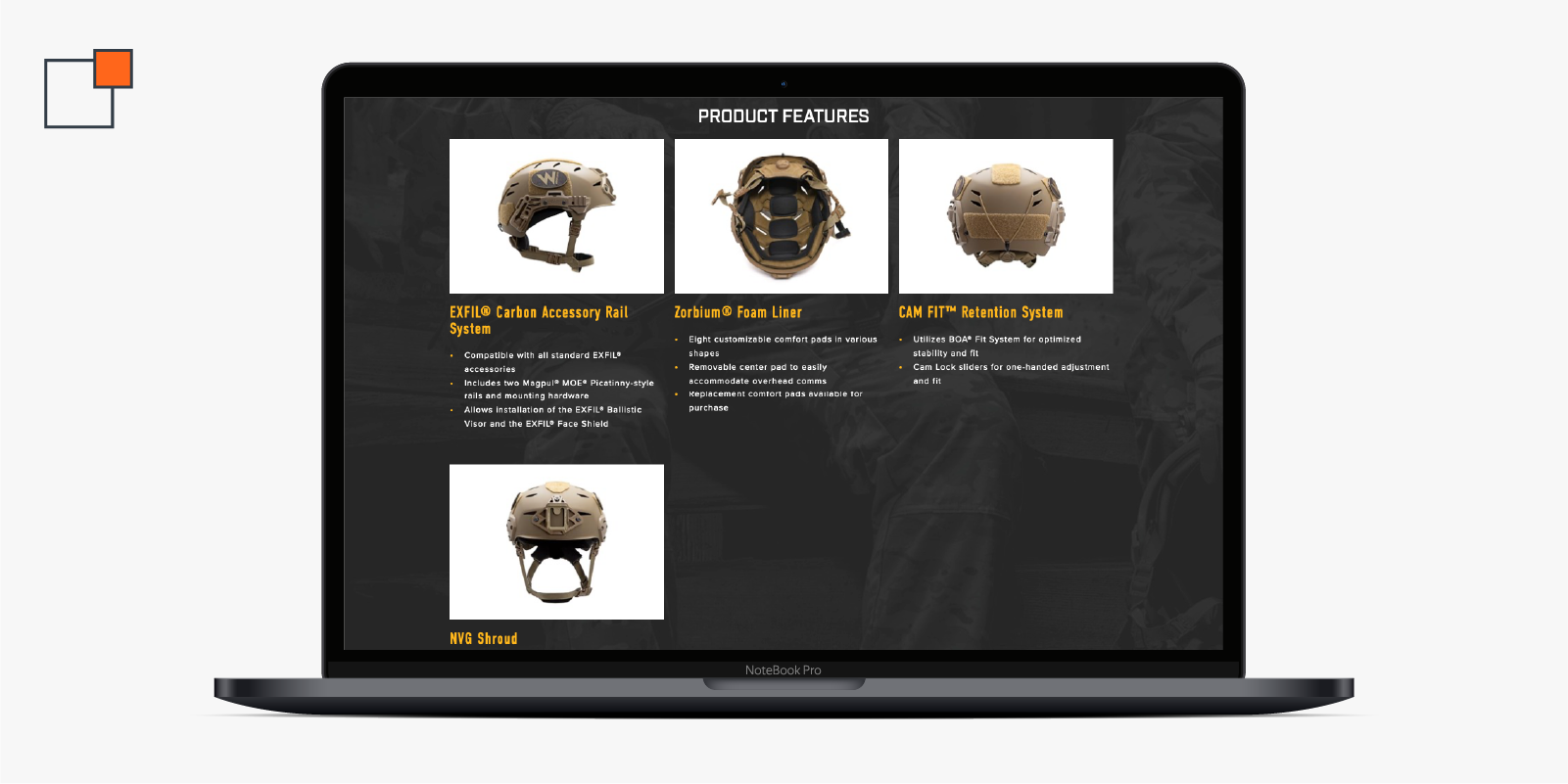
The visuals on a product page are just as important as the words. High-quality images complement your product descriptions by showing customers exactly what to expect. Multiple angles, close-ups of key features or photos of the product in action give shoppers more visual context. We designed PDPs for Team Wendy which showcase their helmets in action and from numerous perspectives to provide customers with a clear understanding of the product's durability, functionality and fit.

But good visuals aren’t just about aesthetics; they need to be optimized, too. Compress your image files for faster page loading without sacrificing quality, and use SEO-friendly file names. For example, “sleek-black-backpack-side-view.jpg” beats “IMG_1234.jpg” every time. If the product is more technical, consider including infographics or diagrams to break down complex features and make it easier for consumers to understand.
Keep mobile shoppers in mind
The mobile shopping experience can’t be an afterthought; over half of all online sales in 2023 came from mobile devices, and that percentage is only going up. This means every part of your product page, from visuals to descriptions, needs to translate well to a smaller screen. Use responsive designs, fast-loading visuals and snappy CTAs to keep mobile shoppers engaged. If the page isn’t smooth and easy to navigate on mobile, you’ll likely lose buyers.
Use social proof to build trust
Shoppers like to know they’re making a sound choice—and what better way to convince them than through social proof? Reviews and ratings give customers the validation they need, while user-generated content (UGC), like photos or testimonials, adds an extra layer of trust to your PDPs.

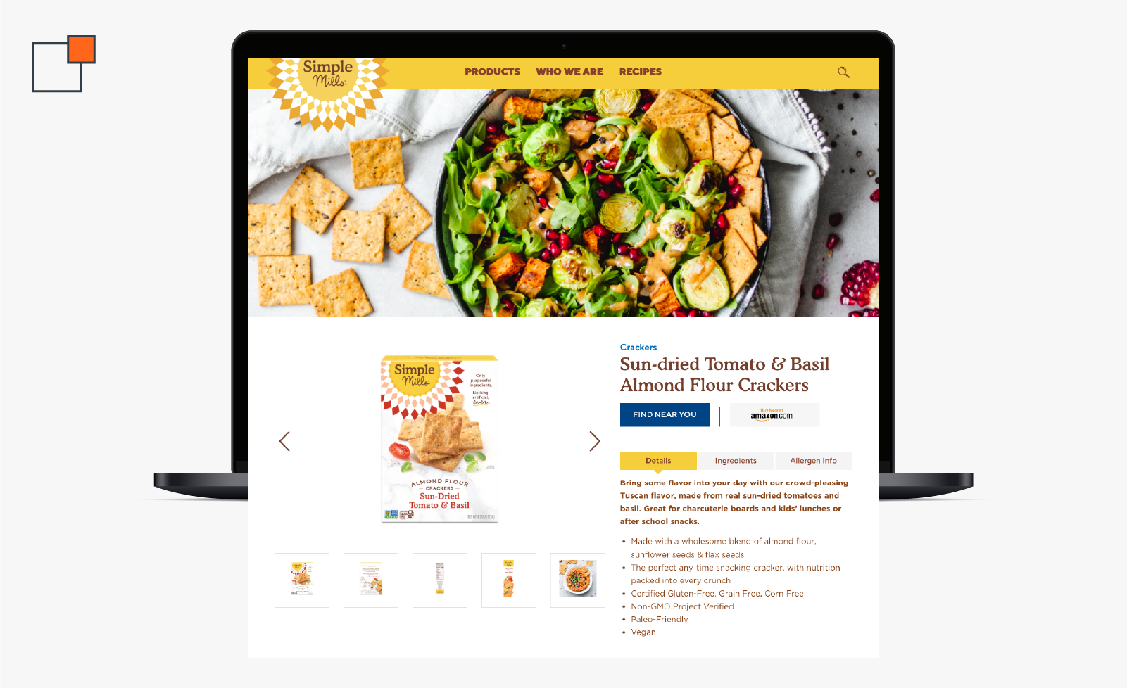
Take a look at the product pages we created for Simple Mills. Ratings and reviews are a prominent feature, showing buyers that others have tried, loved and recommend their nutritious snacks and mixes. When customers see real people enjoying a product, it reinforces its value in a more relatable way.

CTAs that capture attention
When it comes to calls to action (CTAs) on your product pages, subtle just won’t cut it. Your CTA buttons need to stand out and align with what motivates your customers most. Phrases like “Add to Cart” or “Try it Now” give shoppers an immediate sense of direction. Making your CTAs more specific can take them even further. “Save 15% at Checkout” or “Get Free Shipping Today” can provide that little nudge they need to complete their purchase. The more closely your CTAs reflect your customers’ mindset, the more effective they’ll be at turning intent into action.
Creating compelling product experiences
The right language and visuals breathe life into a product, inviting consumers to envision how it fits into their lives. This is what makes PDPs so crucial. By combining clear and concise copy, engaging visuals and effective SEO techniques, you can create an experience that resonates with customers. And remember: this process doesn’t stop once your pages go live; refining them continuously based on customer feedback and performance data is key.
Think your PDPs could use a little polish? Get in touch, and let’s craft a personalized strategy to elevate your product pages. Your customers (and your bottom line) will thank you!
About the Author
Lexie Febel is a Content and PR Coordinator at thunder::tech. Her favorite pastime includes being cozied up with her cats while getting lost in the pages of a compelling book.
