Packaging That Sells Itself
Package design and consumer behavior
Updated: January 2025
POV: You’re in a store aisle, surrounded by a sea of colors and shapes. Your eyes scan the shelves for the familiar brand you always reach for, but something catches your attention—a bold, funky design that practically calls out to you. Should you grab the usual or take a chance on the new?
We’ve all faced this moment of indecision. But what influences our choice? What makes us pick one product over another or struggle to decide at all?
The answer often lies in package design. It's why we gravitate toward the skincare line with a sleek, minimal bottle instead of a cluttered, flimsy box and why the granola bar with vibrant fruit photography or playful illustrations feels more appealing than a plain wrapper. And it's why the power tool in sturdy, well-designed packaging earns our trust over the one hastily wrapped in plastic.
Packaging shapes our perceptions, builds trust and helps make a purchase feel right.
What is packaging design?
Simply put, package design is how a product is enclosed before sale. It serves as the vehicle for the information about what’s inside and tells consumers, at a glance, what to expect from the content within. Package design can vary significantly, which makes it a little confusing to pinpoint where it starts and stops. Package design might be as minimal as a single sticker on a wine bottle, as functional as the box holding rubber gloves or as substantial as the packaging for appliances or furniture.
It’s a consumer's first physical impression of whatever is inside. Because first impressions are made in about seven seconds, every detail matters. The visuals, materials and layout must work together to capture attention while reflecting the essence of what’s inside.
Thoughtful package design isn’t just about aesthetics; it’s about understanding how these elements influence perception and choice. Done well, it can be the deciding factor in a purchase.
The psychology of product packaging
Humans consume information before consuming the product itself. In those first few seconds, the consumer has a sensory and emotional experience, envisioning this product in their life. Effective packaging design goes beyond function; it tells a story and evokes feelings. Whether it’s nostalgia, excitement, trust or luxury, the emotions triggered by a package can foster a deeper connection between the consumer and the product.
When a consumer has limited knowledge of a specific product, they rely on their immediate and emotional connection to the packaging and branding to make a decision. Does your bag of cookies make them feel nostalgic for grandma’s house? Do your tea boxes instantly inspire visions of health and vitality? Consumers desire honesty and clarity when it comes to a brand message and expect to see it on the packaging.
It’s not only the look that counts—materials matter, too. Consumers can quickly distinguish between high- and low-quality packaging. Thoughtful details, such as textured paper, metallic accents or sturdy materials, enhance the perceived value of a product. Premium packaging elements communicate quality and care, allowing for higher price points and greater consumer trust.
Ultimately, the psychology of packaging lies in its ability to influence perception and emotion, turning a simple product into a compelling experience that resonates with consumers on multiple levels.
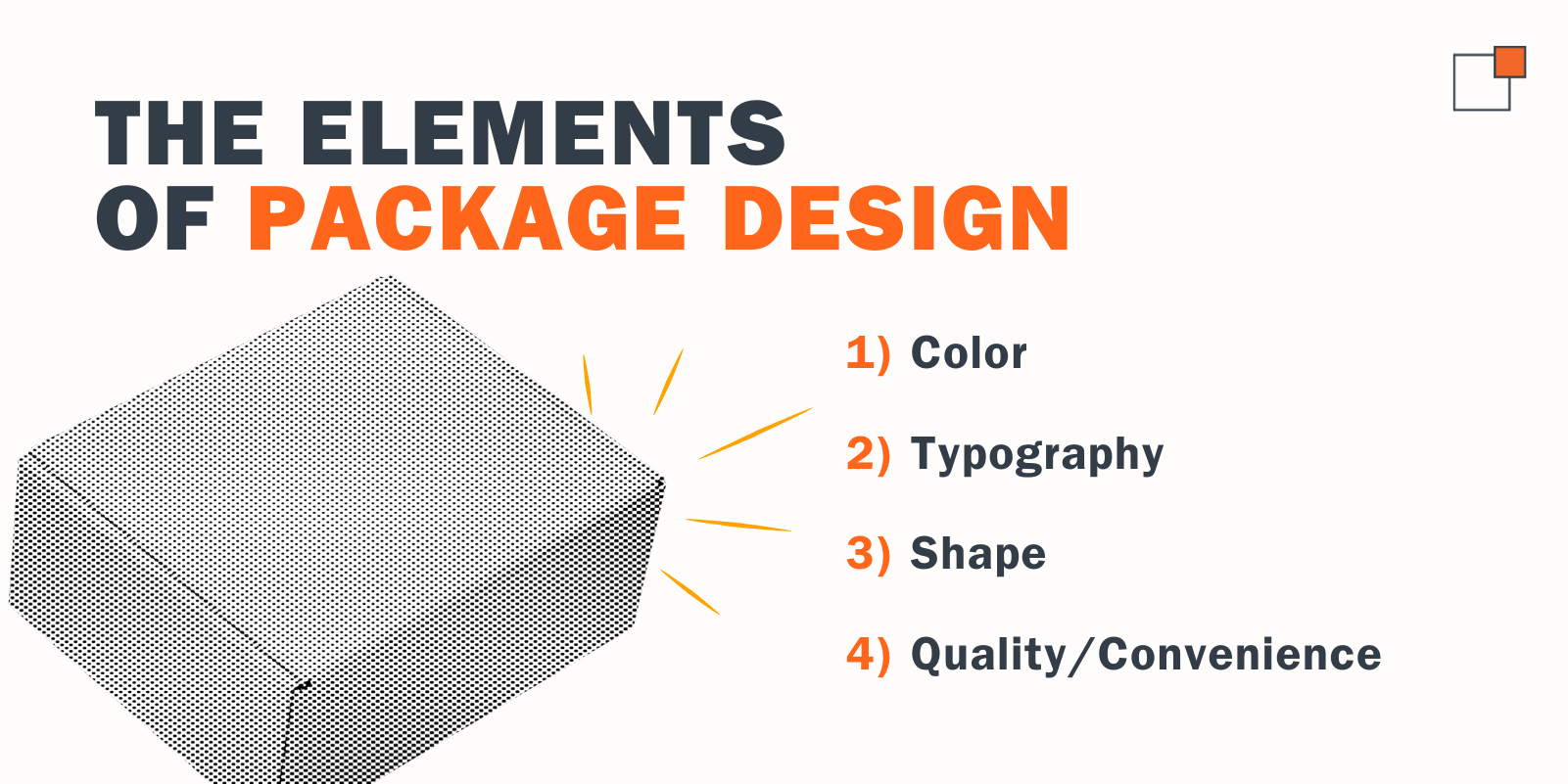
The elements of package design
Let’s break it down into four key categories:
- Color
- Typography
- Shape
- Quality/Convenience
Color
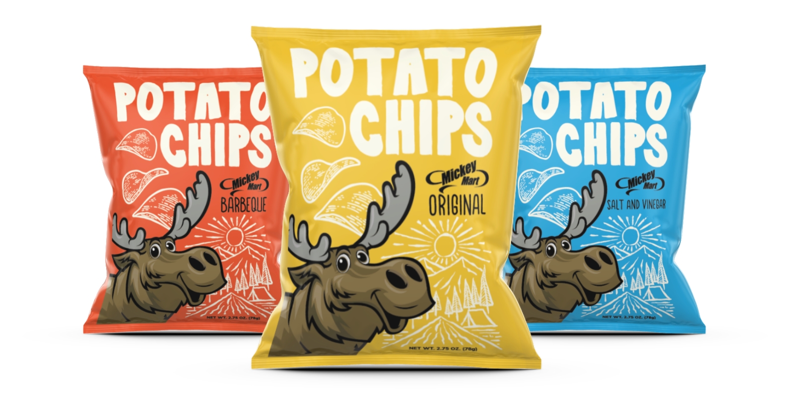
Color is a language all its own, capable of evoking emotions and shaping perceptions instantly. In fact, a staggering 90% of our initial impression of a product comes from its color.
Take Tiffany & Co., for example. Their iconic signature shade of blue is so closely tied to the brand’s identity that it evokes excitement and recognition without a single word or logo. It’s not just a box or a draw-string bag; it’s a promise of what’s inside.
Their deliberate use of color demonstrates the power to go beyond aesthetics to create emotional connections and leave a lasting impression.
The colors you choose for packaging can say a lot about your brand and help attract the right audience. For instance, neon hues might not suit a skincare line that highlights natural ingredients, but they could be perfect for a nail art brand conveying a bold, funky style. Knowing what you want to communicate and understanding your target consumer are key to selecting the right colors to bring your package design to life.

Typography
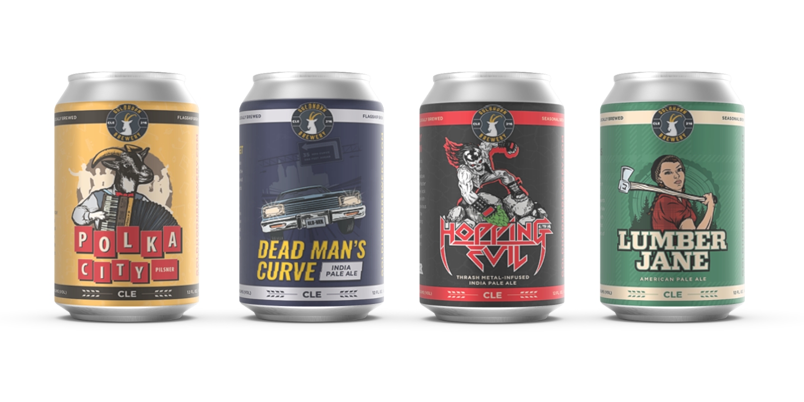
Typefaces and fonts have personalities. They should embody and heighten your product and brand message. The wrong choice might set your brand apart—but not in the way you want. Imagine a luxury brand like Rolex using Comic Sans. While it’s certainly a bold choice, it would completely undermine the brand’s sophistication and impact. On the other hand, the right typography can:
- Elevate your brand identity: Typography should align with your brand’s personality and values, reinforcing the image you want to project.
- Define your product: Fonts communicate tone and purpose. Sleek serif fonts might evoke sophistication, while playful sans-serif fonts can signal a fun, casual vibe.
- Grab attention: Eye-catching typography can stop shoppers in their tracks and draw them into your design.
- Enhance readability: Clear, well-chosen type makes information easier to digest, especially at a glance.
- Build visual hierarchy: By varying font size, weight and style, typography guides consumers through information, highlighting the most important details.
Shape
The shape of a package is a critical element of design that plays a significant role in attracting attention and conveying a product's identity. Unique or unconventional shapes stand out on crowded shelves, drawing consumer interest and encouraging them to pick up the product. Furthermore, the emotional response elicited by a package's shape has a subtle yet powerful impact. Rounded shapes convey softness, friendliness or luxury, while angular designs suggest strength, stability or modernity.Beyond aesthetics, the shape of a package also influences functionality and consumer perception. Thoughtful designs can improve usability; think of food items that offer features like resealable lids, easy-pour spouts or stackable forms that add convenience and practicality. Additionally, compact or efficient shapes can lower storage and transportation costs, appealing to businesses and eco-conscious consumers. By combining form and function, package shapes can elevate your product's appeal and strengthen its presence in the market.
Quality/Convenience
A thoughtfully designed package should feel good in the consumer’s hand, offering an intuitive and seamless interaction. If a premium product like an iPhone were packaged in a flimsy plastic bag, it would erode its perceived value and would likely not be as popular as it is today. Apple not only considered the product but the entire experience of a purchase.Packaging must align with the quality of the product it contains, creating an impression of trustworthiness and excellence. A well-constructed package adds to the tactile appeal and communicates the brand’s commitment to delivering a superior product.
Packaging trends
Brands are rethinking their approach to packaging, blending aesthetics with functionality to stand out and stay relevant. From sustainable materials to nostalgic designs with a modern twist, today’s trends reflect the growing demand for products that not only look good but also align with consumer values and lifestyles. Some noticeable trends we’re seeing include:
1) Paper and glass packaging
As sustainability becomes a top priority for consumers and brands alike, paper and glass packaging are gaining momentum. These materials are eco-friendly alternatives to plastic, offering recyclability and reduced environmental impact.
2) Reusable packaging
Reusable packaging is transforming the way brands approach sustainability and consumer engagement. From refillable bottles and jars to innovative designs like collapsible containers, reusable packs are designed to extend the product's lifecycle beyond its initial use.
3) Dopaminergic design
Inspired by the concept of dopamine dressing in fashion, dopaminergic packaging taps into bright, playful colors and unexpected designs to evoke joy and excitement. These eye-catching packages appeal to the human desire for instant gratification and stand out in both physical and digital spaces.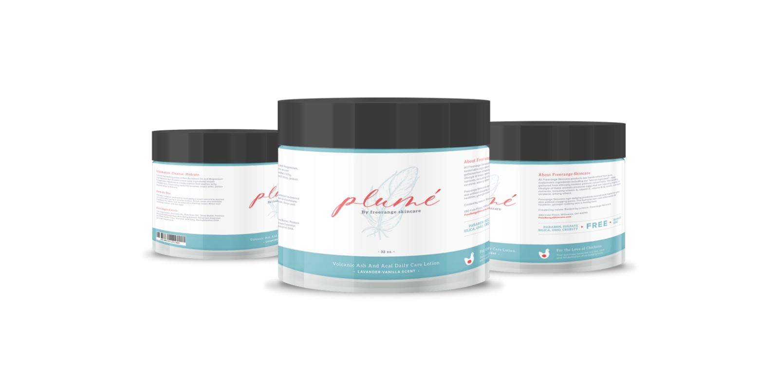
4) Bold-minimal packaging
This trend is all about striking a balance between simplicity and impact. Bold-minimal packaging uses clean lines, ample negative space and simple yet daring design elements to create a modern and sophisticated look. Whether it’s a single oversized logo, high-contrast color schemes or minimal text, this style communicates confidence and clarity.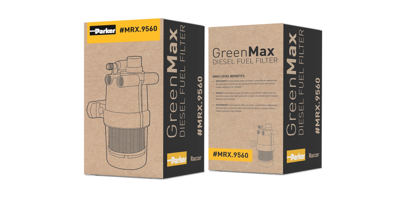
5) Neo-vintage packaging
Neo-vintage packaging combines nostalgic elements with a contemporary twist, blending the charm of retro aesthetics with modern design sensibilities. Think vintage-inspired typography, muted color palettes, and classic motifs paired with sleek layouts or contemporary accents.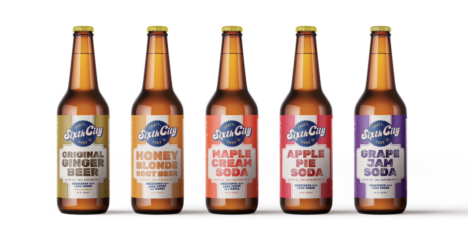
Design now influences every step of the packaging and consumer process. Reusable elements, such as decorative shipping boxes, branded tissue paper and custom bubble wrap, continuously remind consumers of the brand throughout their journey with the product. Every layer of packaging, from unboxing to reuse, is a marketing opportunity that can reinforce brand identity and leave a lasting impression.
The seconds and minutes spent scanning store shelves, as short as they may seem, are make or break in the decision-making process for a consumer. A product’s packaging must immediately capture attention and communicate value, trust and relevance. With design playing a vital role in consumer choices, brands are pushing boundaries with creativity and innovation to earn those precious extra seconds of attention.
Going the extra mile in packaging design isn’t just about standing out—it’s about creating a connection that fosters loyalty. That extra second of interest might be all it takes to turn a casual buyer into a lifelong customer.
Need help with your next visual package design or graphic design work? Contact us today!

About the Author
About the author::Joe Cola, who sadly has no connection to the world famous brand, Coca-Cola, is the Art Director at thunder::tech. When he isn't designing, Joe loves going to the zoo or the metroparks. He also considers himself a "dinosaur expert."
Ready to see what we can do for you?
Let's connect and explore how we can amplify your brand.