From Mockups to Monitors
Strategies for adapting mockups to different screen sizes
Have you ever spent hours perfecting a web design on your computer, only to realize that it looks like a hot mess on a different device? We feel your pain. As designers, we all know the struggle of adapting our beautiful mockups to different screen sizes. And let's be honest, it's not the most exciting part of the design process. But fear not, we're going to make this task a little less daunting and a lot more fun with a few strategies that simplify the process.
Are mockups just pictures?
Website mockups are static visual models of what a web page, website or web application will look like in its final form. But when a graphic designer creates a mockup of a website, they can only capture what it will look like at one screen size. Suppose you resize the mockup in the program you use to view it. In that case, all of the elements, the spaces within and between them, the typography and the accent lines will scale in perfect proportion, identical to resizing a photograph. However, web pages, once built using code, don’t behave this way.
As the viewport size grows or shrinks, some elements, such as photographs, will scale proportionally while others, such as typography, will stay the same size and flow around the remaining space. Layout ideas that work at one size might not work at another, and therefore you need to rearrange the entire format. Graphic designers will create multiple mockups of the same page to accurately show the final design on different screen sizes.

The limitations of responsive design
Responsive design is an approach to web design that aims to create websites that can adapt and respond to different screen sizes and devices, such as desktops, laptops, tablets and smartphones. With responsive design, the layout and content of a website will adjust and change based on the size of the screen, providing an optimal viewing experience for the user. The website will look and function well on any device without needing separate designs or code implementations.
Responsive design aims to ensure that users can easily access and navigate a website, regardless of their device. Its user-friendly nature has made it the standard expectation for websites today.
However, there are some limitations. A web design is only as good as its content, and many organizations structure their information in a way that is unsuitable for larger screens. For example, there aren’t any design principles for 4K monitors because so few people use them. Still, a web page should respond reasonably to being asked to display at a large size. At thunder::tech, we use a few different techniques to address this concern, depending on our client’s individual needs and goals.
Guides and gutters
thunder::tech uses two types of visual guides to help solve the extra-large monitor problem. The first is called a page canvas wrap, which contains the entire page’s layout within a narrower region of the viewport with an intentional visual break between it and the rest of the viewport. We center this region and use a simplistic background behind it. We apply this to almost all of our sites, although most people never see it because it is 1920 pixels wide: the width of a high-definition monitor. We can add a background color, shadow or pattern, but no full-width elements extend past this edge.
The other type of visual guide is hidden within the page canvas wrap called a content wrap, to which the content aligns. These are often smaller than the page canvas wrap and help to keep content layouts proportional.
The side gutter is the space between the content wrap and the edge of the viewport or between the guidelines if the page canvas wrap is not visible due to a small viewport. To prevent the content from hitting the edge of the viewport, the side gutter has a minimum size that adjusts based on the screen size: smaller on mobile devices and larger on larger monitors. However, when the width of the content wrap hits its designated maximum, the side gutter grows to absorb the difference.

Strategies to adjust for screen size (and a few to avoid)
To ensure your designs look great and function on any screen your user may be on, follow these strategies to adjust your mockups appropriately:
1. Use thunder::tech’s standard wrap sizes
While specific wrap sizes may vary from project to project, the dimensions we typically choose reflect the expected audiences and the devices they will use. Our typical dimensions mirror the pixel width of an average notebook computer; accordingly, the page canvas wrap is usually 1920 pixels wide, and the content wrap is 1360 pixels wide. Since the content wrap is in the center of the page canvas wrap, this creates a side gutter of up to 280 pixels per side.

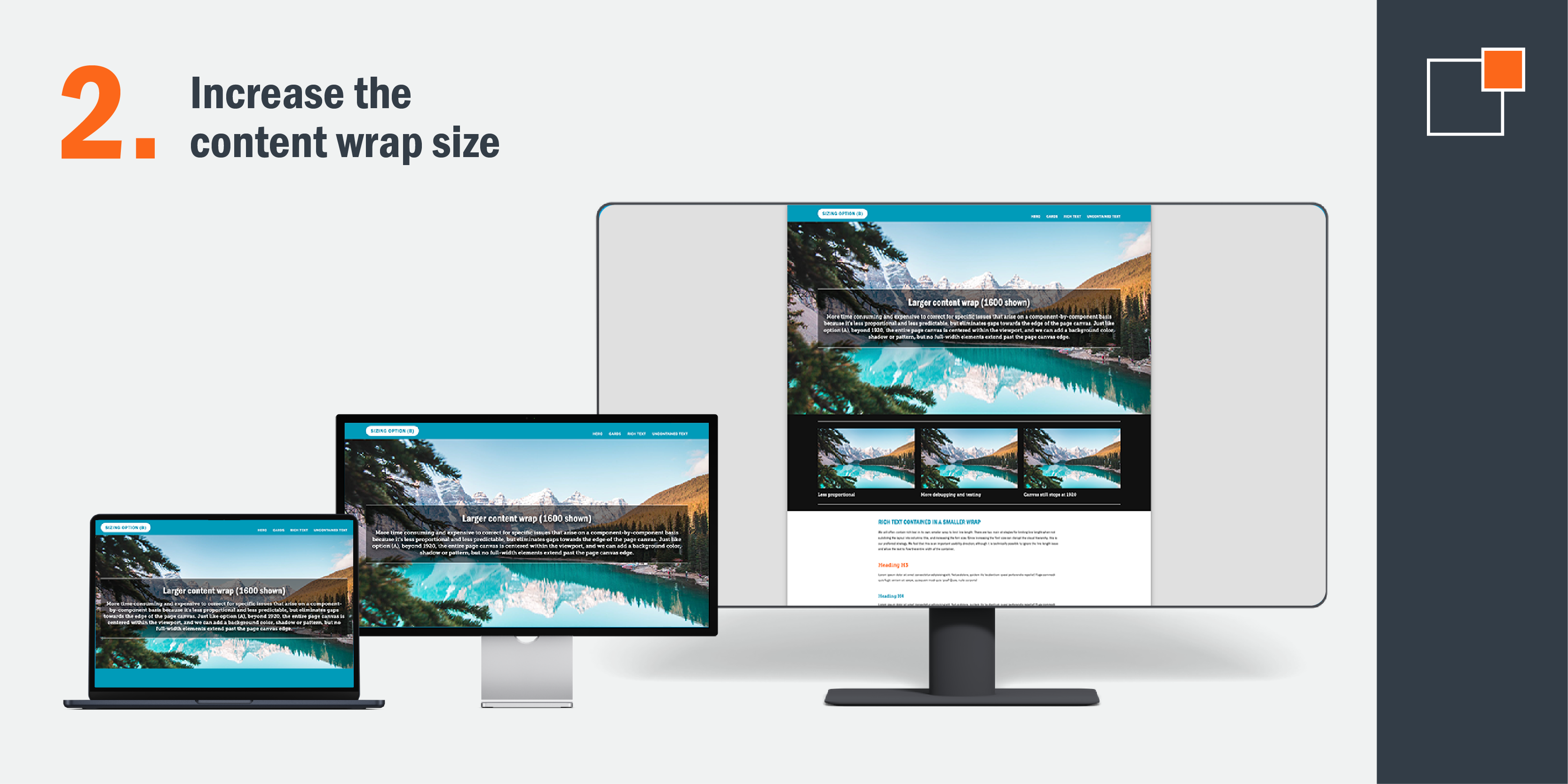
2. Increase the content wrap size
If you replaced a content wrap of 1360 pixels with one of 1600 pixels, you’d shrink the side gutter to 160 pixels per side. This would allow you to utilize more screen real estate as long as you adjust the overall layout and balance of the design accordingly.

3. Decrease the page canvas wrap size
It's also possible to decrease the side gutter size by reducing the page canvas wrap size instead of, or in addition to, expanding the content wrap size. If the page canvas wrap increases to 1440 pixels instead of 1920 pixels while holding the content wrap at 1360, this results in 40 pixels per side.

Last resort strategies (avoid if you can!)
1. Removing all containment
While still technically an option, removing all containment is the least predictable in terms of proportion. Immersive backgrounds and images will scale up with the viewport size indefinitely, but text and content images won't, so their ratios compared to each other are completely dependent on the viewport size. We advise against this strategy for many reasons, one of which is that it contradicts best practices for ensuring optimal user experience in terms of text readability. These best practices emphasize setting limits on the number of characters per line, a goal that becomes impossible with this particular option.

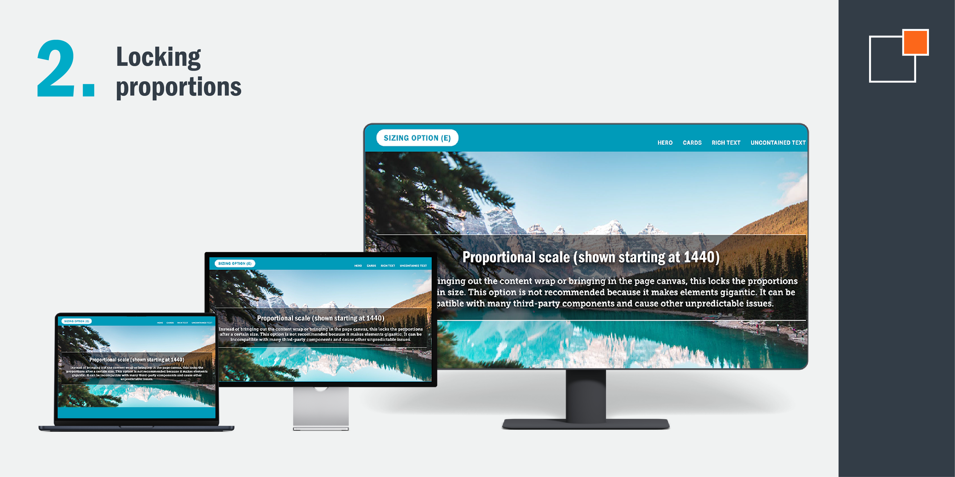
2. Locking proportions
The final option causes the site to lock its scale past a particular viewport size width as though it were an image. Among the drawbacks of this approach are that it causes elements to become disconnected proportionally from the rest of the features on the user’s screen, making them enormous at substantial viewport sizes. Another drawback of this approach is that some embedded third-party components aren’t compatible with it, including but not limited to most of those which rely on iframes. When a component is incompatible with this approach, it won’t scale with the rest of the page and, therefore, can appear proportionally tiny.

Making a sizing strategy decision best for your website
The best approach is to build your site with the correct sizing strategy from the start. Though it’s possible to change the strategy after the front-end development has concluded or even after a whole site is complete, requesting such changes at a late stage can lead to additional costs and significant delays. This is due to a combination of both overarching factors and specific considerations related to each user interface component.
The cost and time can also depend on how the site was built, meaning that two identical-looking sites with slightly different implementations could potentially have very different costs and turnaround times. By incorporating the correct sizing strategy right from the start of the development process, you can effectively save both time and money compared to making adjustments at a later stage.

Creating web designs that look great across different screen sizes can be a daunting task for designers. While responsive design has become the default assumption for all sites, it has limitations, especially for larger screens. But regardless of the strategy you use, different-sized screens will simply display designs differently, which is why understanding how the designs function is so crucial in setting realistic expectations for the final site.
If your audience tends to switch between visiting your site on a mobile device versus a monitor, adjusting your website design to accomplish the same outcome can become a headache. Let our designers jump in and help you create a site that perfectly responds to screens of all sizes. How? Just contact us today!